
I think there was a very significant element of President Obama's (I do relish every opportunity I get to say that) campaign that generally went undiscussed, and yet, in this humble blogger's opinion, contributed in immeasurable ways to his complete takeover of the youth vote. Barack Obama, his staff, and the David's (who really deserve their own category) understood the importance of good design online and in print.
Consider the respective campaign stickers of Obama and McCain. Because I truly loathe Blogspot's image uploader, I will simply provide links for your convenience:
Obama: Here
McCain: Here
Before I examine the two stickers more closely, a basic primer on type:
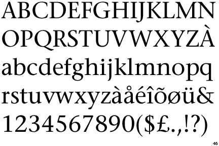
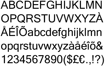
There are, in the most basic terms, two different types of fonts: Serif and Sans Serif.
You can notice the obvious differences. "Serif" is just a fancy word for the useless little nibs at the end of each stroke that make a font like Times New Roman look "official" and, objectively speaking, "old." You've seen ancient English or Chinese calligraphy - it's all about the small details and fancy swooshes you could add. It doesn't help readability, but it looks opulent, fancy, and, again, official.
Logically, a "Sans-Serif" font is a typeface that doesn't have any of the useless squiggles and nibs. As opposed to serif fonts, sans-serifs appear "clean" and "modern." You see these most prominently in signs ("STOP" or "23rd Street Station") because of the simple fact that they're easier to read.
Now look again at the stickers. McCain is using a subtle serif font (you can tell mainly because of the C's). I don't know what it is, but I know that I don't like it. If you look up other examples of the sticker in higher quality, you'll notice there are weird dips at the edges of each character. The font also remains consistent in advertising McCain's website, making the URL (as well as the candidate) seem implicitly antiquated.
In contrast, Obama's website is written in a very clear sans-serif. It's how we're used to seeing websites advertised - refer to the Ebay, Amazon, and MySpace logos as examples. In fact, nowadays (and especially if you use a Mac), the only program you'll find yourself commonly using serifs in is Microsoft Word. This makes sense because the output in Word is print, and unless you're in Europe, most if not all printed material you consume is printed using serif fonts. When older folks complain about disliking reading too much information on the screen, it generally has to do with the fact that sans-serifs simply appear foreign to them. Because of the lack of serifs (the aforementioned "nibs"), it's more difficult to gain a context of where a word literally ends. Sans-serifs compel you to continue reading on and on and on. Like on this blog (I'm amazed you got this far).
Obama's actual name, of course, is written in serif. Again, it's official. Politicians love it. Had to be done. As an interesting tangent: Notice that in 2004, Kerry was the one using ugly serif fonts, and Bush threw serifs completely out the window - even his name was in an enormous, bold sans serif. Conspiracy? Wink wink.
Really, looking at the design elements of Obama's campaign is looking at a masterful execution of balancing sans-serifs with serifs. "CHANGE" was always in that bold, easy-to-read, modern lettering. Of course when Shepard Fairey got his hands on the font and pulled out the "HOPE" poster, he took it to a whole new level. Which brings me to my next point:
McCain's sticker has no relevant symbol. It has a star, which has more to do with America than McCain, and those yellow arrows that symbolize...I don't know what (The Golden Years?). Obama's symbol, on the other hand, is now the stuff of marketing legend. The "O" reminding you who it's all about, mapped out to appear to be a re-imagining of the flag. It's also very familiar, because we in America drive past Bank of America branches all the time.
All of this is really just a ploy to direct you toward the new White House website. Prior to Obama's election I think I ended up there once. On accident. But seriously. Check it out here. It's clear whoever was behind President Obama's campaign website was hired again, and even though it's full of serifs (they've got to look official, remember), look out for where their modern counterparts are applied.
Also, the White House now has a Youtube Channel, where, among other things, you can check out the President's Blog and watch Weekly Reports from Pres. Obama himself:
I really do love the 21st century.
Saturday, January 24, 2009
Subscribe to:
Post Comments (Atom)


No comments:
Post a Comment